

Hansel Soans Case study
Glide Invest app icon Motilal Oswal · Product Design

Glide
Invest

Making investing simpler, from the first tap onwards.

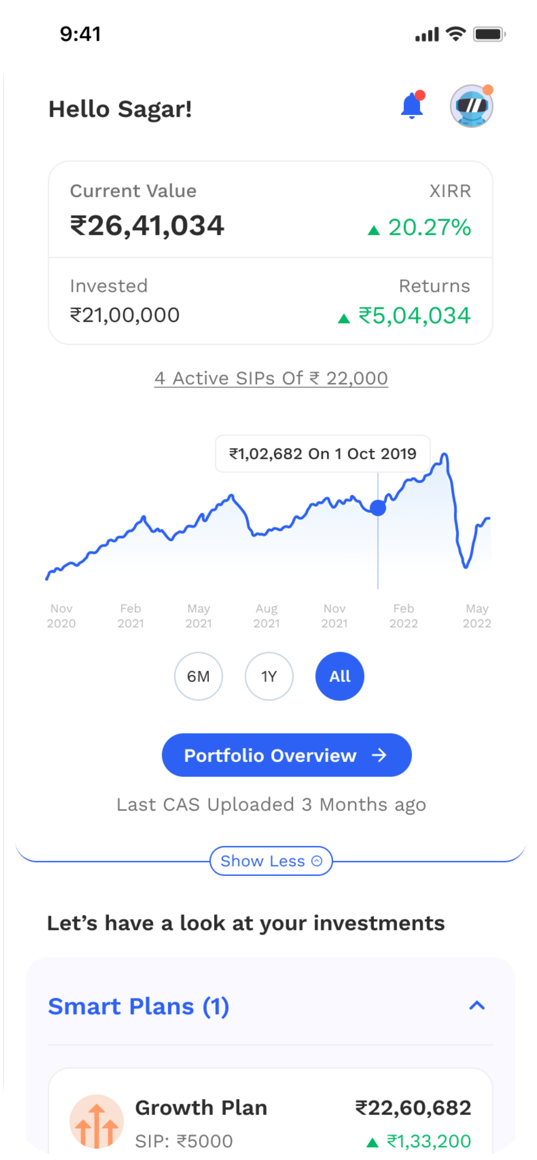
Glide Invest homepage — portfolio value, returns chart and Smart Plans
Role  Product Designer Team  PM, 2 Engineers Scope  Onboarding + app revamp
Motilal Oswal
Two chapters, one product
02 Context

A mutual fund app built to be advised, not researched.

Glide Invest was Motilal Oswal's mutual fund app. Rather than handing people a fund screener and letting them work it out, it led with expert-built portfolios — Smart Plans in Growth, Balanced and Defensive variants — and goal-based investing for things like an emergency fund or a child's education.

The audience was people early in their investing lives: comfortable with apps, new to mutual funds, and reliant on the product to tell them what a sensible decision looked like. Everything between installing the app and holding a portfolio — KYC, risk profiling, picking a plan — was regulated, unavoidable and unfamiliar.

Smart Plans Goal-based investing Mutual funds & SIPs KYC & risk profiling
“Best way to grow your wealth. Plans built for you by experts.
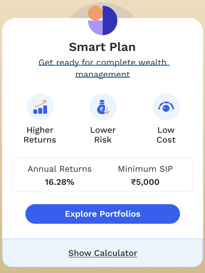
Glide Invest Smart Plan card — higher returns, lower risk, low cost, with annual returns and minimum SIP
The Smart Plan card on the homepage — the expert-built portfolio the product led with.

The plans were sound. Reaching them was the problem.

Next — Getting people started
03 Getting people started

Nobody dropped out over the funds. They dropped out before reaching them.

Before anyone could hold a single unit of a mutual fund, they had to pass through KYC and a risk-profiling questionnaire — both required, both regulated. That questionnaire was the product's first real conversation with a new investor, and it was written in the language of the industry rather than the language of the person answering it.

01

Conceptual Gap

First-time users struggled to understand mutual funds, leading to high drop-off at the first hurdle.

02

Abstract Risk

Risk profiling felt abstract and intimidating, causing users to guess answers instead of providing accurate data.

The flow, as it stood
Dense forms with technical jargon Multiple diverging paths causing choice paralysis No visual indication of progress or outcome
User problem

“I don't know how to answer these questions. I just want to invest my money, but I feel like I'm taking a math test I didn't study for.”

The fork in the road

“Guide me” or “Do it myself”

Assumption

Offering a self-directed path next to a guided one respects people who already know what they want. We tested both with 8 users, expecting the split to tell us which to invest in.

Observed

“Most users chose ‘Do it myself’ by default, then felt lost within the first three screens.”

The choice wasn't read as a choice. It was read as the confident answer.

Decision

Remove the self-serve path. One guided flow, with optional skips for anyone who wants to move faster — guidance as the default rather than a branch people opt into.

The testing insight

Choice without context creates false confidence → confusion

“Users don't want to fill forms. They want guidance before making financial decisions.”

Next — Redesigning onboarding
04 Redesigning onboarding

The question was no longer how much choice to offer, but how much guidance to give.

The flow was rebuilt as one route with three jobs: introduce a person who would help, ask six questions in plain language, and hand back a result the user could actually read. Clean, minimal interface designed to reduce friction and provide clear progression.

Carried forward from the test
Before Two doors: “Guide me” and “Do it myself”.
After One guided flow with optional skips.
Also changed Humanized the journey
Also changed Real-time risk profile visualization
01. Introduction & Trust Building

Someone to answer to, before any questions

Introduced a humanised entry point with a wealth advisor to build trust early Framed onboarding as “we'll guide you” instead of a task Subtle animation (advisor avatars) added warmth and approachability

“I'll guide you throughout this investment journey..”

Entry — the advisor introduces herself
“Answer a few questions, it takes less than 3 mins.”
02. Guided Questions Flow

Six questions, one decision each

Simplified language to make financial questions easy and relatable Added progress indicators (1 of 6, 2 of 6…) to reduce uncertainty Included “Do it later” to lower pressure and prevent drop-offs
1 of 6  Why do you want to open an account with us?
2 of 6  Tired of working! When do you want to retire?
3 of 6  How disciplined are you in your investments today?
4 of 6  How would you rate your investment knowledge?
5 of 6  What do you expect from your investments?
6 of 6  If your investment value falls by 20%, you will?
03. Outcome & Feedback

An answer, not a score

Delivered a clear investor identity (e.g. Growth / Balanced / Defensive) Provided a sense of completion and instant gratification Reinforced trust through transparent, easy-to-understand results
“You want best of both worlds for your investments - stability and high returns.” “You give your investments enough time to appreciate for compounding growth.”
15% reduction in onboarding drop-offs
The result, in the user's own terms
Growth / Balanced / Defensive

The door worked. What people walked into was the next problem.

Chapter two — the product itself
05 Chapter two

The product itself

The work started as an onboarding revamp. Midway through, it became clear the homepage was just as vital to the journey — it was the first thing people saw once they were in, and it decided whether they ever invested.

So the scope widened: a simplified, personalised homepage for every user, whether they had invested before or not.

Redesigned Glide Invest homepage
The homepage, as it stood

Everything the app could do, all on the first screen.

In informal conversations, users told us they wanted help picking funds. The homepage answered with emergency funds, goals, campaign banners, a second goals list and two identical “Create Goal” buttons — and no single place to start.

The homepage before the revamp
1

Cognitive overload

After landing on the homepage, users were confused by the number of options and features.

2

No IA in place

Five tabs in the bottom navigation — Home, Goals, Funds, Learn, Profile — with no structure deciding what belonged where.

3

No clear primary task

Users got lost on the homepage. Nothing on it said what to do first.

The new direction

Remove the distractions. Lead with the one thing only Glide offered.

That was Smart Portfolio — the expert-built plans from Chapter One. The homepage would be rebuilt around it, with everything else earning its place underneath.

What had to change, and how did the experience get rebuilt around it?

Next — Rethinking the homepage
07 Key design decisions

Four decisions that changed what the app asked of people.

Wireframe prototypes went through 30 usability tests, and the designs were reworked on that feedback. These are the changes that held.

01

Five tabs became three

Problem. The bottom navigation was overwhelming and confusing. Goals and Funds sat beside Home and Learn as equals, so people had to know the product's structure before they could use it.

Decision. Structure the navigation around user needs. Every way to put money in — Smart Plans, Goals, Mutual Funds — moved under a single Invest tab.

Before
Home Goals Funds Learn Profile
After
Home Invest Learn
Invest → Smart Plans · Goals · Mutual Funds
Invest → Smart Plans
Invest → Goals
Invest → Mutual Funds

Why it mattered. Deciding to invest no longer meant first deciding between a goal and a fund. There was one place to go, and the choice happened inside it.
02

Show the growth before asking for the money

Problem. Users needed some immediate validation — a way to see what their investment could grow into — before committing to a plan.

Decision. Put a calculator upfront. It sits directly beneath the Smart Plan card on the homepage, next to the plan's annual returns and minimum SIP, rather than inside a separate tool.

Why it mattered. The question a new investor actually has — what would this do for me? — could be answered on the first screen.

03

A reason to finish KYC

Problem. KYC was lengthy and mandatory, and nothing in it gave the user anything back.

Decision. Gamify the flow. Completing KYC earns rewards, and the prompt lives on the homepage as an offer rather than a warning.

Why it mattered. A regulatory step became the first thing the product rewarded.

Make the most of our rewards! Take your first step for financial independence and get rewarded
Complete KYC G +50
Homepage rewards card, redrawn at 2× from the Figma file
04

Stories instead of articles

Problem. New investors were expected to learn by reading long articles.

Decision. Introduce Stories as a lighter, more engaging way in, with blogs, videos, podcasts and a jargon guide organised as channels in the Learn tab.

Why it mattered. Learning stopped competing with investing for attention, and became something people could dip into.

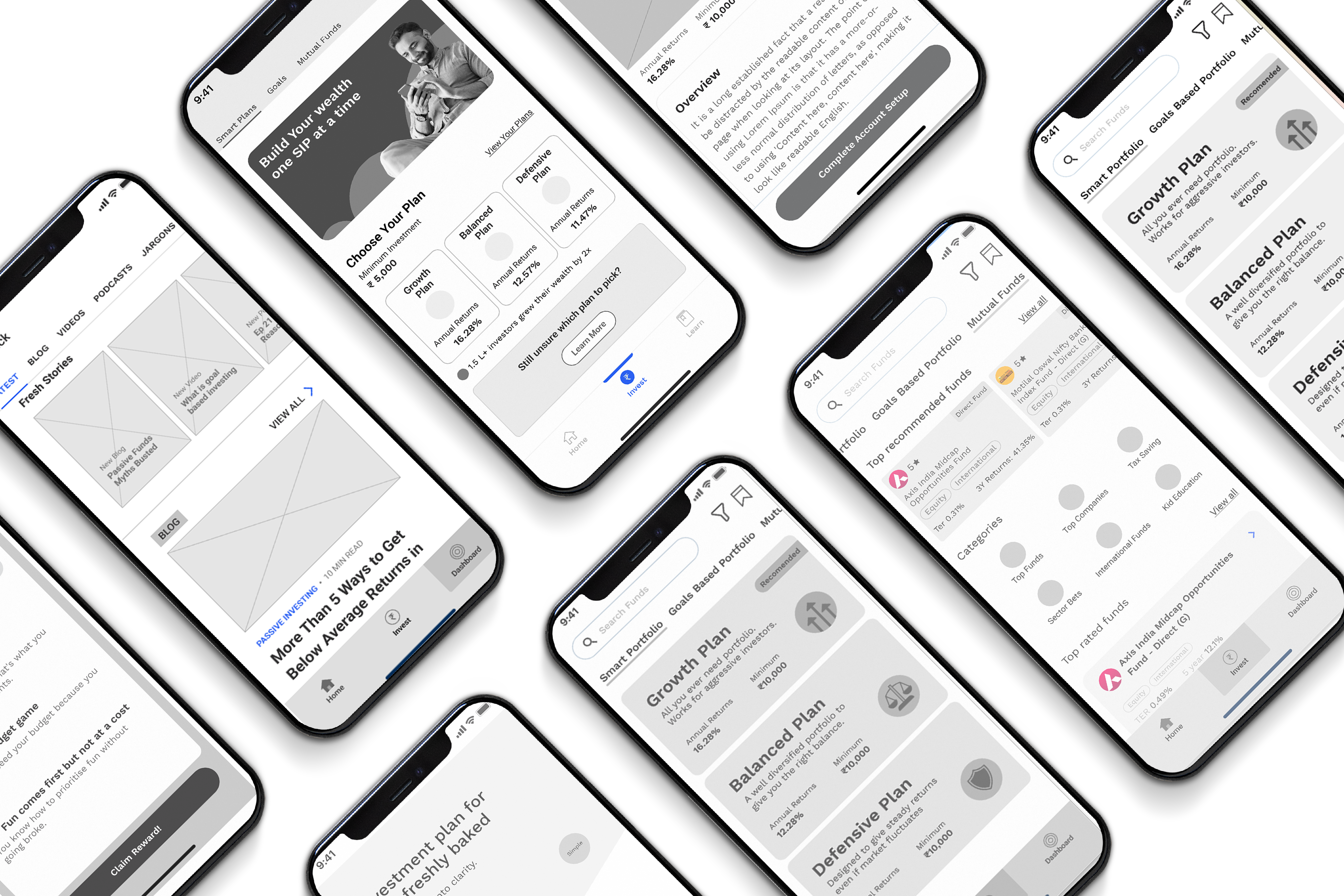
Wireframe of the Learn tab with Fresh Stories, blog, videos, podcasts and jargon channels
Learn tab in the usability-test prototype — Fresh Stories leading the channels
Underneath all four An optimised page layout: the product could now show more, with less user effort.

That's the thinking. Here is the product it produced.

Next — The redesigned product
08 The redesigned experience

Three tabs. One next step on every screen.

Home
Home · first visit
Home · plan recommended
Home · invested
Next — Outcome & reflection
09 Outcome

Fewer decisions, asked at better moments.

Onboarding became a single guided route that ended with an investor identity instead of a score, improving completion rates and user confidence through contextual education and progressive disclosure.

The product behind it was restructured to match: three tabs instead of five, a homepage led by Smart Portfolio, growth shown before commitment, and KYC turned into a reward. The wireframes behind it went through 30 usability tests and were reworked on that feedback.

Reflection
1

Removing a feature can improve the experience.

Taking away the self-serve path felt like taking away control. It increased satisfaction instead, because the one path that remained was much stronger. I stopped treating choice as something that is always generous to offer.

2

Context does more work than layout.

A single line of contextual micro-copy was often more effective than a complete screen redesign. In a regulated flow where the questions can't change, how they are framed is where most of the design happens.

3

Onboarding isn't finished at the last screen.

I set out to fix a flow and realised midway that the homepage was part of the same journey. A clear path in means little if the first screen afterwards asks people to make sense of everything at once.

Glide Invest Smart Plan card

“Best way to grow your wealth. Plans built for you by experts.”